Loading...
← Zurück zur Community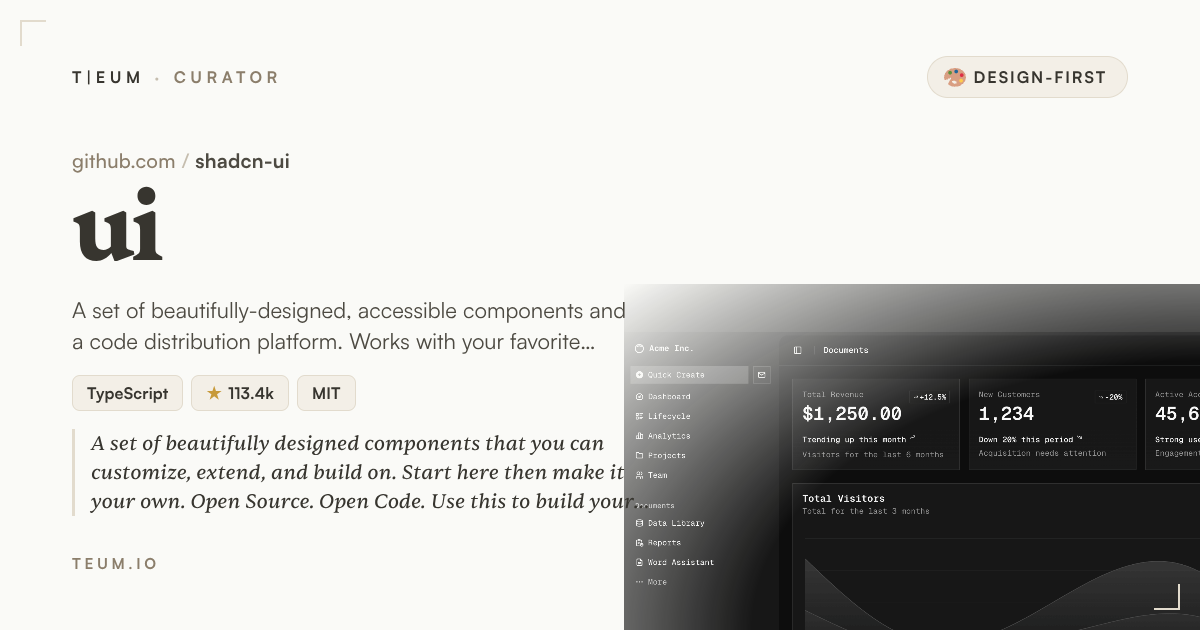 Quellegithub.com/shadcn-ui/ui
TA
1mo ago143 Aufrufe0 Antworten
Stop Spending Weekends on UI Polish — Use shadcn/ui
The component library that makes your product look like a designer touched it
You shipped a working product on Friday. By Sunday night you're tweaking button padding and arguing with yourself about which gray is the right gray. Sound familiar?
Setting
Shadcn/ui arrived at a moment when the frontend ecosystem was drowning in choice but starving for taste. Most component libraries give you a box of Lego bricks — functional, sure, but visually interchangeable with every other app on Product Hunt. Shadcn/ui, built and maintained by a solo developer who goes by shadcn, took a different bet: what if the components were so well-designed out of the box that the average full-stack developer could skip the design phase almost entirely?
With over 112,000 stars on GitHub and active commits as recently as April 2025, the project has clearly struck a nerve. It sits at the intersection of Radix UI (a library of accessible, unstyled interactive components — think dropdowns, modals, tooltips that work correctly for keyboard and screen-reader users) and Tailwind CSS (a utility-first styling system), with a thin layer of carefully chosen visual decisions on top. The result lives at shadcn-ui/ui and its live demo at https://ui.shadcn.com shows you exactly what you get before you write a single line.
The Story
Here is the concrete scenario that makes shadcn/ui different from every other UI kit you have tried before.
Imagine you are building a SaaS dashboard for a side project. You need a data table with sortable columns, a modal confirmation dialog, a date picker, and a command palette (the keyboard shortcut menu that power users love). In a typical setup, you spend a weekend sourcing four different libraries, fighting their conflicting CSS, and still ending up with components that look like they came from four different products.
With shadcn/ui, you run a single command — npx shadcn@latest add table dialog calendar command — and those four components land directly inside your project as editable source code. Not a black-box dependency you cannot touch. Your actual files. You open components/ui/dialog.tsx and change the border radius or the animation timing to match your brand in five minutes. The components already follow a coherent color system built on CSS custom properties (variables you set once and every component inherits automatically), so changing your primary brand color updates the entire interface in one edit.
The visual quality is not accidental. Every component on the demo site passes WCAG accessibility standards (the international guidelines for making interfaces usable by people with disabilities), uses smooth Tailwind-driven transitions, and ships with both a light and a dark theme that toggle without any extra configuration. The README hero image — a clean grid of polished component previews — is not marketing fiction. Open the demo and it looks exactly like that.
For designers on the team, or for makers doing everything themselves, the practical outcome is real: you spend less time explaining "why does this button look slightly off" and more time on the features that differentiate your product.
The Insight
Most developer tools optimize for capability. Shadcn/ui optimizes for impression — the gut feeling a user gets in the first three seconds on your product. That is the design-first bet it makes.
The reason it works is ownership. Because the components live in your codebase rather than locked inside an npm package you cannot modify, you never hit a ceiling. Start with the defaults (which are genuinely good), then customize as your product earns the attention that justifies custom design work. It is the rare library that scales from "I need something that looks professional by Monday" all the way to "we have a full design system now."
A PM looking at two competing indie tools — one with default browser-style forms and one with shadcn/ui components — will unconsciously trust the second one more. That trust converts. That is the 30% impression lift hiding in a component library.
If you are building something you intend to put in front of paying users, the visual layer is not a nice-to-have — it is the first argument your product makes. Tools that look finished attract serious buyers. That logic applies on any platform where makers sell their work, including teum.io/sell, where polished product presentation consistently separates the listings that sell from the ones that sit.
한국어 요약
shadcn/ui는 개발자가 디자인에 쏟는 시간을 줄여주는 컴포넌트 라이브러리입니다. 컴포넌트를 직접 소스코드로 프로젝트에 추가하기 때문에 마음대로 수정할 수 있고, 기본 디자인 완성도 자체가 높아서 별도 디자이너 없이도 제품이 "완성된 것처럼" 보입니다. 다크모드, 접근성, 일관된 컬러 시스템이 기본 제공되며, 사이드 프로젝트부터 SaaS까지 규모에 상관없이 잘 작동합니다. 시각적으로 완성도 높은 툴은 teum.io/sell 같은 마켓플레이스에서도 실제로 더 잘 팔립니다.
Most developer tools optimize for capability. Shadcn/ui optimizes for impression — the gut feeling a user gets in the first three seconds on your product.
#design-system#ui-components#shadcn#tailwindcss#fullstack#kind:design_first